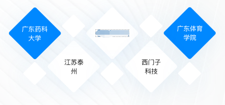
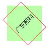
在按设计稿搭建项目页面时,碰到了一处内容呈现方式如下图所示的元素。文字在菱形边框内居中摆放的布局看似简单,却让我陷入了长时间的束手无策。如果只是通过 transform 将一个 div 旋转 45deg,其内的文字也会跟着转动,这显然不符合要求。
双重旋转相抵消
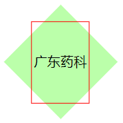
在尝试一通无果后,我开始在网上查找资料,借此发现了一个巧妙的方法:在 div 里套一个 span 文本。将 div 进行旋转 45deg,同时将 span 设置成行内块元素后再逆向旋转 45deg,这样就能使得文字水平排列。
1
2
3
4
5
6
7
8
9
10
11
12
13
14
15
16
17
18
19
20
21
22
23
24
25
26
27
28
29
| <!DOCTYPE html>
<html lang="en">
<head>
<meta charset="UTF-8" />
<meta http-equiv="X-UA-Compatible" content="IE=edge" />
<meta name="viewport" content="width=device-width, initial-scale=1.0" />
<title>Document</title>
<style>
.box {
width: 85px;
height: 85px;
transform: rotate(45deg);
background-color: #bfa;
}
.box .txt {
width: 60px;
display: inline-block;
transform: rotate(-45deg);
text-align: center;
border: 1px solid red;
}
</style>
</head>
<body>
<div class="box">
<span class="txt">广东药科大学</span>
</div>
</body>
</html>
|
实现效果如下:
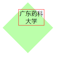
单行文本居中
尽管文字是水平了,但位置在水平和垂直方向上并没有居中。我们可以仅添加两行 CSS 语句来实现居中效果,具体如下所示。
1
2
3
4
5
6
7
8
9
10
11
12
13
14
15
16
17
| .box {
text-align: center;
width: 85px;
height: 85px;
transform: rotate(45deg);
background-color: #bfa;
}
.box .txt {
line-height: 85px;
width: 60px;
display: inline-block;
transform: rotate(-45deg);
text-align: center;
border: 1px solid red;
}
|
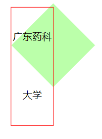
为了方便理解,这里先取消对 div 的旋转,并适当减少文本字数。
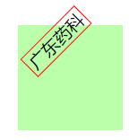
第一步:将 span 的 line-height 设成 div 的高度,可以看到 span在垂直方向上已经处于 div 的正中间(上下两侧凸出的红色小三角形全等);
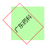
第二步:对 div 设置text-align: center,可以看到 span在水平方向上移动到了 div 的正中间(左右两侧凸出的红色小三角形全等)。
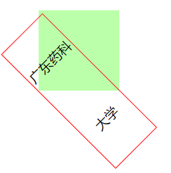
恢复对 div 的旋转后,成功实现文字绝对居中的效果。
但这种需要借助 line-height 的方法只适用于单行文本的排布。当文本不止一行时,则会…
需要提醒的一点是,虽然看似位置偏移得很奇怪,但如果取消对 div 的旋转,就能发现在它在水平方向上仍然是居中的。
多行文本居中
对于多行文本,我们可以对 div 采用 flex 布局,来实现文本的绝对居中。
1
2
3
4
5
6
7
8
9
10
11
12
13
14
15
16
17
| .box {
display: flex;
justify-content: center;
align-items: center;
width: 85px;
height: 85px;
transform: rotate(45deg);
background-color: #bfa;
}
.box .txt {
width: 60px;
display: inline-block;
transform: rotate(-45deg);
text-align: center;
border: 1px solid red;
}
|
效果如下:

说到底,旋转边框内的文字居中和常规的文字居中所使用的方法是完全一样的,旋转的边框只不过是一种障眼法。