BFC 到底是什么东西
BFC(Block Formatting Context/块级格式化上下文)可以看作是是⼀块独⽴的区域,让处于其内部的元素与外部的元素互相隔离。
W3C官方解释为:BFC决定了元素如何对其内容进行定位,以及与其它元素的关系和相互作用,当涉及到可视化布局时,Block Formatting Context提供了一个环境,HTML在这个环境中按照一定的规则进行布局。
怎样触发 BFC
这里简单列举几个触发BFC使用的CSS属性
- 根元素,即 HTML 元素
- overflow 不为 visible
- position: absolute | fixed
- display: table-cell | inline-block | flex
BFC 的规则
BFC 就是页面中的一个隔离的独立容器,容器内部元素不会影响外部元素BFC 就是一个块级元素,块级元素会在垂直方向一个接一个的排列(两个相邻的块级元素之间的上下外边距会发生重叠,重叠后的外边距为两者中的较大值。创建新的 BFC 可以避免外边距重叠)- 计算
BFC 的高度时,浮动元素也参与计算 BFC 区域不会与浮动的容器发生重叠- 每个元素的左
margin 值和容器的左 border 相接触
BFC 解决了什么问题
1. 使用 Float 脱离文档流,高度塌陷
1
2
3
4
5
6
7
8
9
10
11
12
13
14
15
16
17
18
19
20
21
22
23
24
25
26
27
| <!DOCTYPE html>
<html lang="en">
<head>
<meta charset="UTF-8">
<meta http-equiv="X-UA-Compatible" content="IE=edge">
<meta name="viewport" content="width=device-width, initial-scale=1.0">
<title>高度塌陷</title>
<style>
.box {
margin: 100px;
width: 100px;
height: 100px;
background: red;
float: left;
}
.container {
background: #000;
}
</style>
</head>
<body>
<div class="container">
<div class="box"></div>
<div class="box"></div>
</div>
</body>
</html>
|
效果:
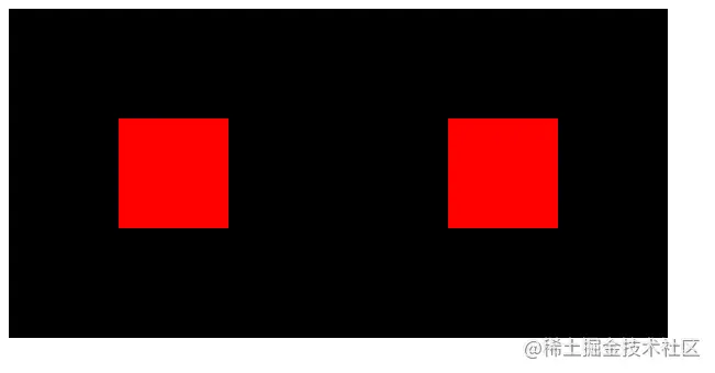
可以看到上面效果给box设置完float结果脱离文档流,使container高度没有被撑开,从而背景颜色没有颜色出来,解决此问题可以给container触发BFC,上面我们所说到的触发BFC属性都可以设置。
修改代码
1
2
3
4
5
6
7
8
9
10
11
12
13
14
15
16
17
18
19
20
21
22
23
24
25
26
27
28
| <!DOCTYPE html>
<html lang="en">
<head>
<meta charset="UTF-8">
<meta http-equiv="X-UA-Compatible" content="IE=edge">
<meta name="viewport" content="width=device-width, initial-scale=1.0">
<title>高度塌陷</title>
<style>
.box {
margin: 100px;
width: 100px;
height: 100px;
background: red;
float: left;
}
.container {
background: #000;
display: inline-block;
}
</style>
</head>
<body>
<div class="container">
<div class="box"></div>
<div class="box"></div>
</div>
</body>
</html>
|
效果:
2. 外边距重叠
1
2
3
4
5
6
7
8
9
10
11
12
13
14
15
16
17
18
19
20
21
22
23
| <!DOCTYPE html>
<html lang="en">
<head>
<meta charset="UTF-8">
<meta http-equiv="X-UA-Compatible" content="IE=edge">
<meta name="viewport" content="width=device-width, initial-scale=1.0">
<title>Document</title>
<style>
.box {
margin: 10px;
width: 100px;
height: 100px;
background: #000;
}
</style>
</head>
<body>
<div class="container">
<div class="box"></div>
<div class="box"></div>
</div>
</body>
</html>
|
效果:
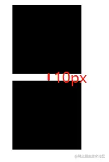
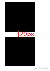
可以看到上面我们为两个盒子的margin外边距设置的是10px,可结果显示两个盒子之间只有10px的距离,这就导致了margin塌陷问题。为了解决此问题可以使用BFC规则(为元素包裹一个 BFC 的盒子,使得 BFC 盒子的内部元素不受外面布局影响),或者简单粗暴地将一个设置margin,一个设置padding。
修改代码
1
2
3
4
5
6
7
8
9
10
11
12
13
14
15
16
17
18
19
20
21
22
23
24
25
26
| <!DOCTYPE html>
<html lang="en">
<head>
<meta charset="UTF-8">
<meta http-equiv="X-UA-Compatible" content="IE=edge">
<meta name="viewport" content="width=device-width, initial-scale=1.0">
<title>Document</title>
<style>
.box {
margin: 10px;
width: 100px;
height: 100px;
background: #000;
}
.box-wrapper {
overflow: hidden;
}
</style>
</head>
<body>
<div class="container">
<div class="box"></div>
<div class="box-wrapper"><div class="box"></div></div>
</div>
</body>
</html>
|
效果:
3. 两栏布局
1
2
3
4
5
6
7
8
9
10
11
12
13
14
15
16
17
18
19
20
21
22
23
24
25
| <!DOCTYPE html>
<html lang="en">
<head>
<meta charset="UTF-8">
<meta http-equiv="X-UA-Compatible" content="IE=edge">
<meta name="viewport" content="width=device-width, initial-scale=1.0">
<title>两栏布局</title>
<style>
div {
width: 200px;
height: 100px;
border: 1px solid red;
}
</style>
</head>
<body>
<div style="float: left;">
两栏布局两栏布局两栏布局两栏布局两栏布局两栏布局两栏布局两栏布局两栏布局两栏布局两栏布局两栏布局两栏布局
</div>
<div style="width: 300px;">
我是蛙人,如有帮助请点个赞叭,如有帮助请点个赞叭,如有帮助请点个赞叭,如有帮助请点个赞叭,如有帮助请点个赞叭,如有帮助请点个赞叭
</div>
</body>
</html>
|
效果:

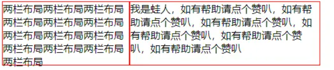
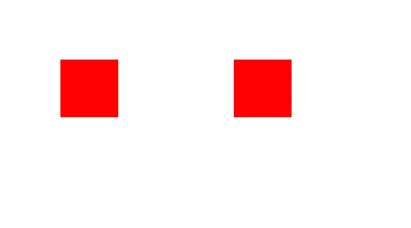
可以看到上面元素,第二个div元素为300px宽度,但是被第一个div元素设置Float脱离文档流给覆盖上去了,解决此方法我们可以把第二个div元素设置为一个BFC。
修改代码
1
2
3
4
5
6
7
8
9
10
11
12
13
14
15
16
17
18
19
20
21
22
23
24
25
| <!DOCTYPE html>
<html lang="en">
<head>
<meta charset="UTF-8">
<meta http-equiv="X-UA-Compatible" content="IE=edge">
<meta name="viewport" content="width=device-width, initial-scale=1.0">
<title>两栏布局</title>
<style>
div {
width: 200px;
height: 100px;
border: 1px solid red;
}
</style>
</head>
<body>
<div style="float: left;">
两栏布局两栏布局两栏布局两栏布局两栏布局两栏布局两栏布局两栏布局两栏布局两栏布局两栏布局两栏布局两栏布局
</div>
<div style="width: 300px;display:flex;">
我是蛙人,如有帮助请点个赞叭,如有帮助请点个赞叭,如有帮助请点个赞叭,如有帮助请点个赞叭,如有帮助请点个赞叭,如有帮助请点个赞叭
</div>
</body>
</html>
|
效果: